Summary
Last week Cambridge Assessment hosted a conference on the theme of Gender Differences. Gender differences in education are frequently discussed in the media, both in the UK and internationally, and last month our graphic examined the gender gap in attainment at GCSE. This month, we look at how the gender gap changes at different stages of the education system.

What does the chart show?
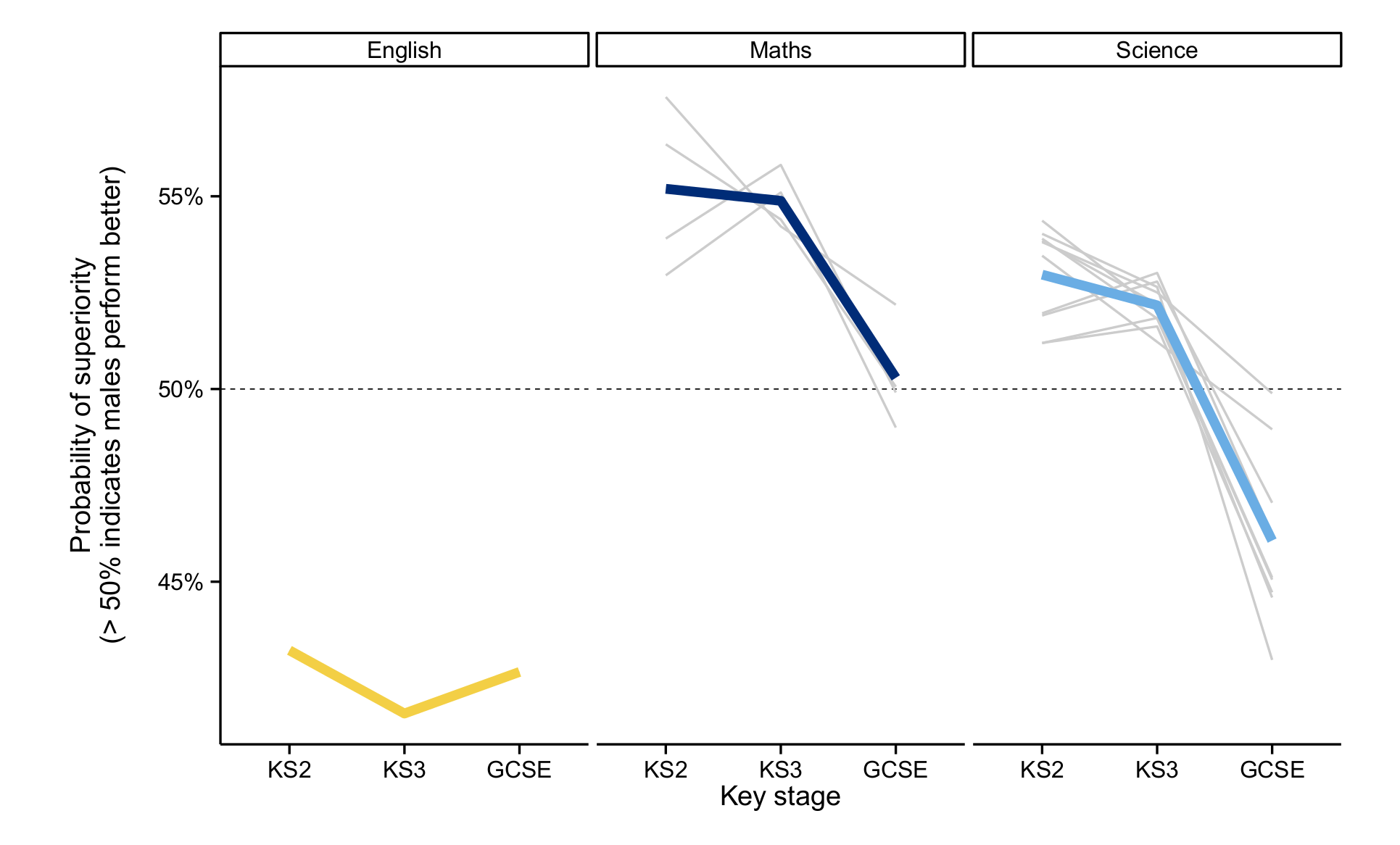
The chart shows the difference in performance for girls and boys for three subjects (English, Maths, and Science) at three stages in a student’s educational career: Key Stage 2 (at age 11), Key Stage 3 (at age 14) and GCSE. The gender gap is defined by the probability of superiority, which represents the probability that a randomly chosen boy would have a higher score than a randomly chosen girl, with both selected from the actual distribution of scores on the exam.
The data are sourced from internal OCR databases, along with the National Pupil Database which is managed by the Department for Education. Each grey line on the chart represents the group of students certificating in a particular OCR GCSE specification in 2010; the coloured lines give the overall average for a subject category. The results present the performance of a single cohort, the last to take externally assessed Key Stage 3 tests, in 2008.
Why is the chart interesting?
The chart shows that, within this cohort, there was a distinct difference in the gender gap between English, and Maths and Science. In the former case, girls outperformed their male peers throughout these Key Stages. However in Maths and Science boys performed better than girls in Key Stages 2 and 3, but the gap narrowed significantly at GCSE. Indeed the average probability of superiority for all Science subjects favoured females by GCSE.
View PDF